1. Introduction
Wakelet’s iOS app had evolved separately from the web product, with a dedicated team and design patterns that diverged significantly over time. While the app served the same users, it offered a fragmented experience that differed in navigation, components, and interaction patterns.
I led the end-to-end redesign as the Lead Product Designer on this initiative, auditing the existing iOS experience, understanding how users moved between web and mobile, and driving a platform-native redesign. The goal was to reduce complexity, improve consistency, and enable faster, more reliable development.
I led the end-to-end redesign as the Lead Product Designer on this initiative, auditing the existing iOS experience, understanding how users moved between web and mobile, and driving a platform-native redesign. The goal was to reduce complexity, improve consistency, and enable faster, more reliable development.
2. The problem
Although the iOS app and web product served the same audience, they had diverged to the point where users were effectively learning two different products.
This created several issues:
- Inconsistent navigation patterns and mental models between platforms
- Increased cognitive load for users switching contexts
- Higher build time and error rates for engineering due to custom components
- Slower iteration caused by maintaining separate design patterns
The core problem was not a lack of features, but a lack of alignment.
How do we create a consistent experience for users moving between web and mobile, while reducing the complexity of maintaining two increasingly divergent products?
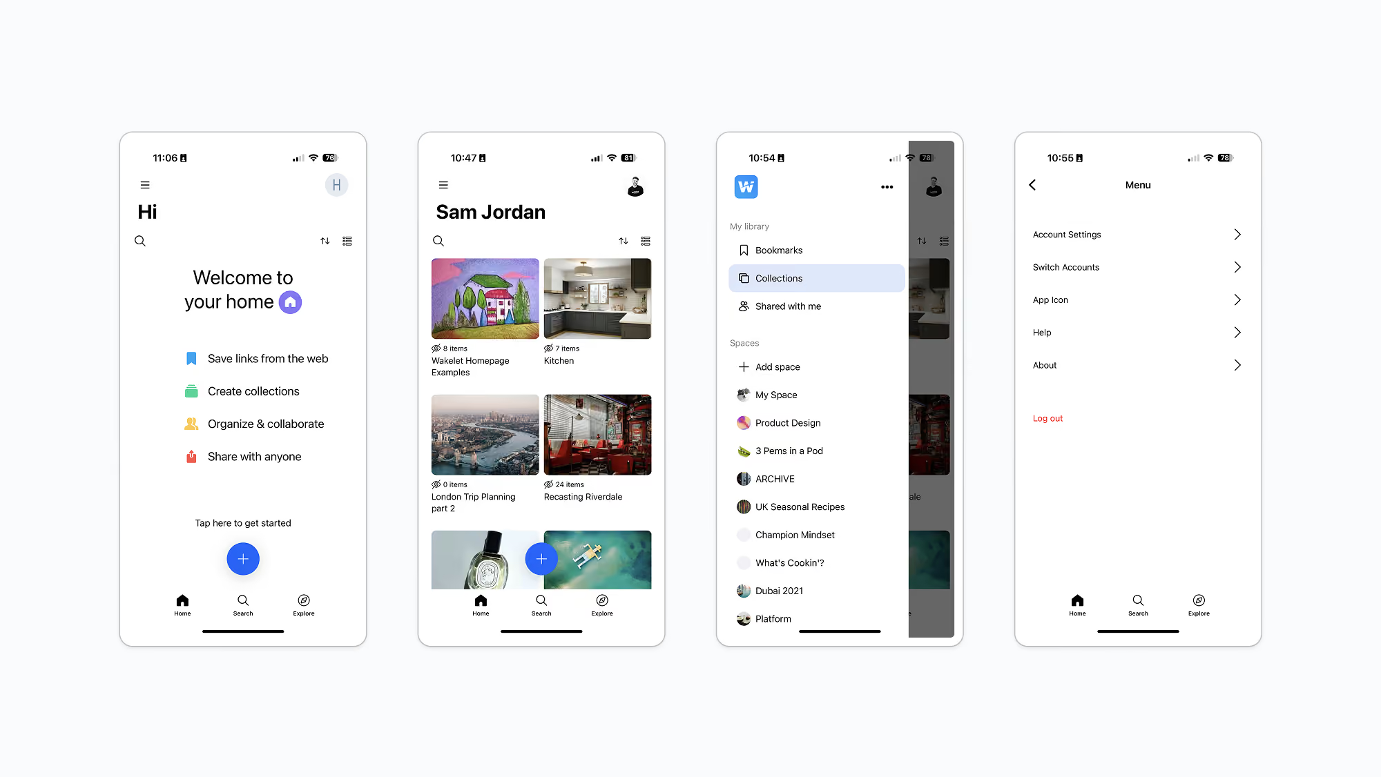
The original iOS experience, highlighting navigation, layout, and interaction patterns that had diverged from the web platform
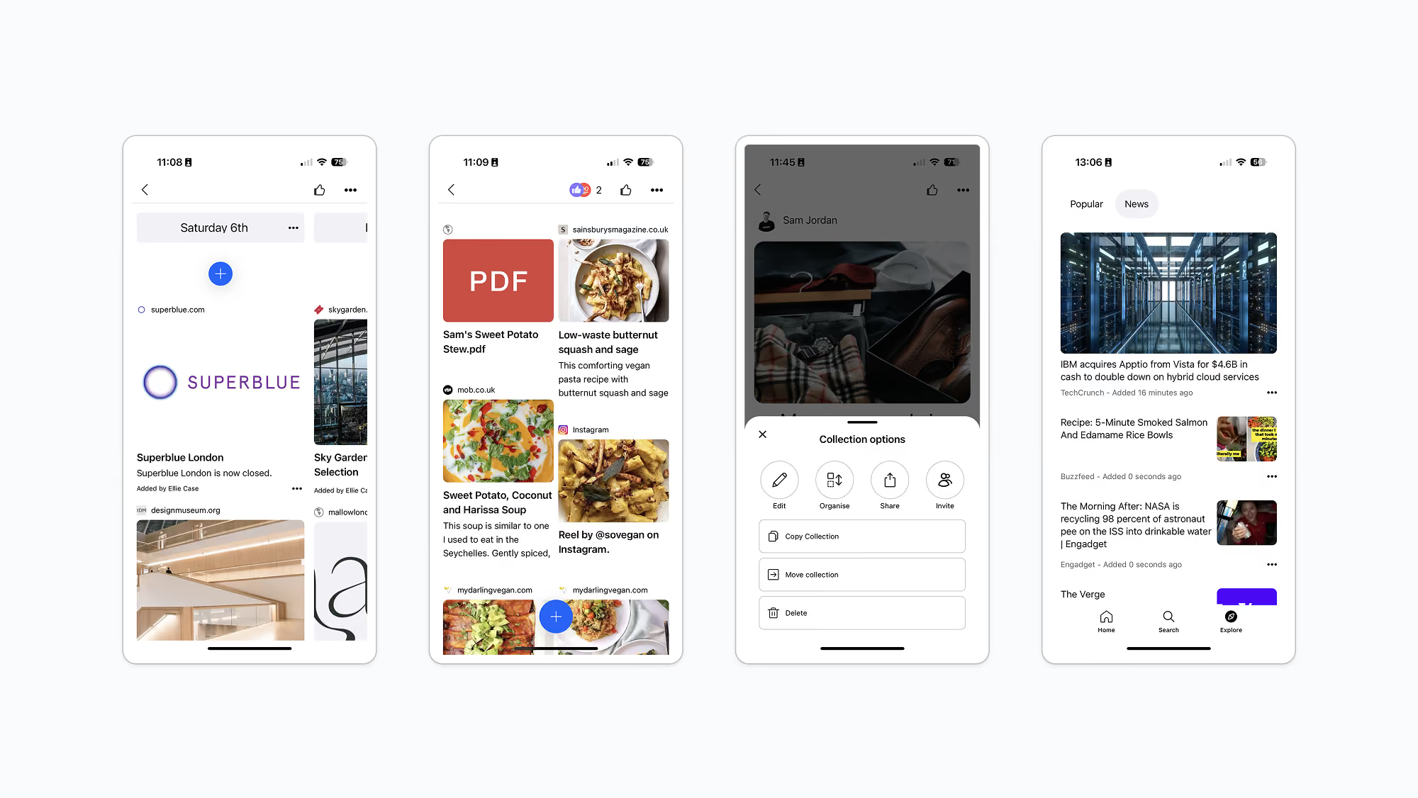
Additional screens from the original iOS experience, illustrating inconsistent layouts, navigation patterns, and system interactions
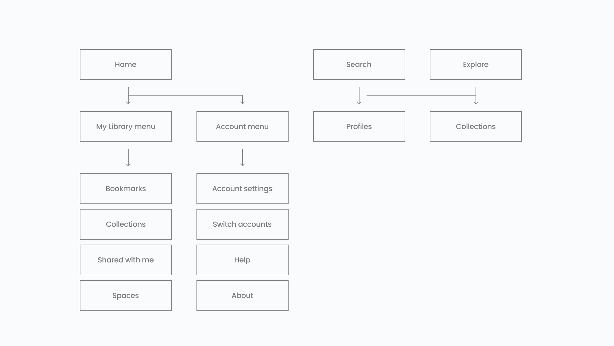
The original information architecture, mapping the structure and navigation of the existing iOS experience
3. Context & constraints
- The iOS app had been developed by a separate team from the web product
- Any redesign needed to minimise disruption to existing users
- Reduced engineering capacity meant we needed to lower system complexity to enable faster, lower‑cost iterative design and build cycles
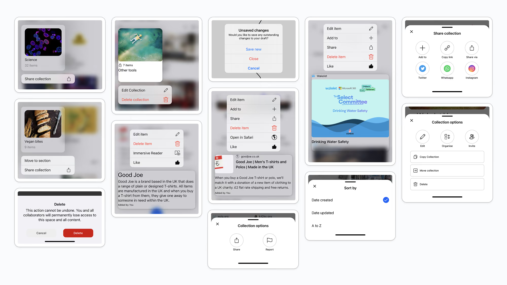
A selection of interface patterns from the original iOS app, audited to identify inconsistencies in components and interactions
4. Discovery & insight
I began with a comprehensive audit of the iOS app, reviewing navigation patterns, components, and user flows across key areas of the product. In parallel, I spoke with users to understand how and when they used Wakelet on mobile versus web.
Key insights included:
- Users were routinely switching between web and mobile throughout the day, meaning inconsistency between platforms created unnecessary cognitive overhead and relearning
- Users expected similar information architecture across devices
- Custom components increased complexity without adding clear user value
- Platform-native patterns felt more intuitive and trustworthy to users
This reinforced the need to prioritise consistency and familiarity over bespoke mobile design.
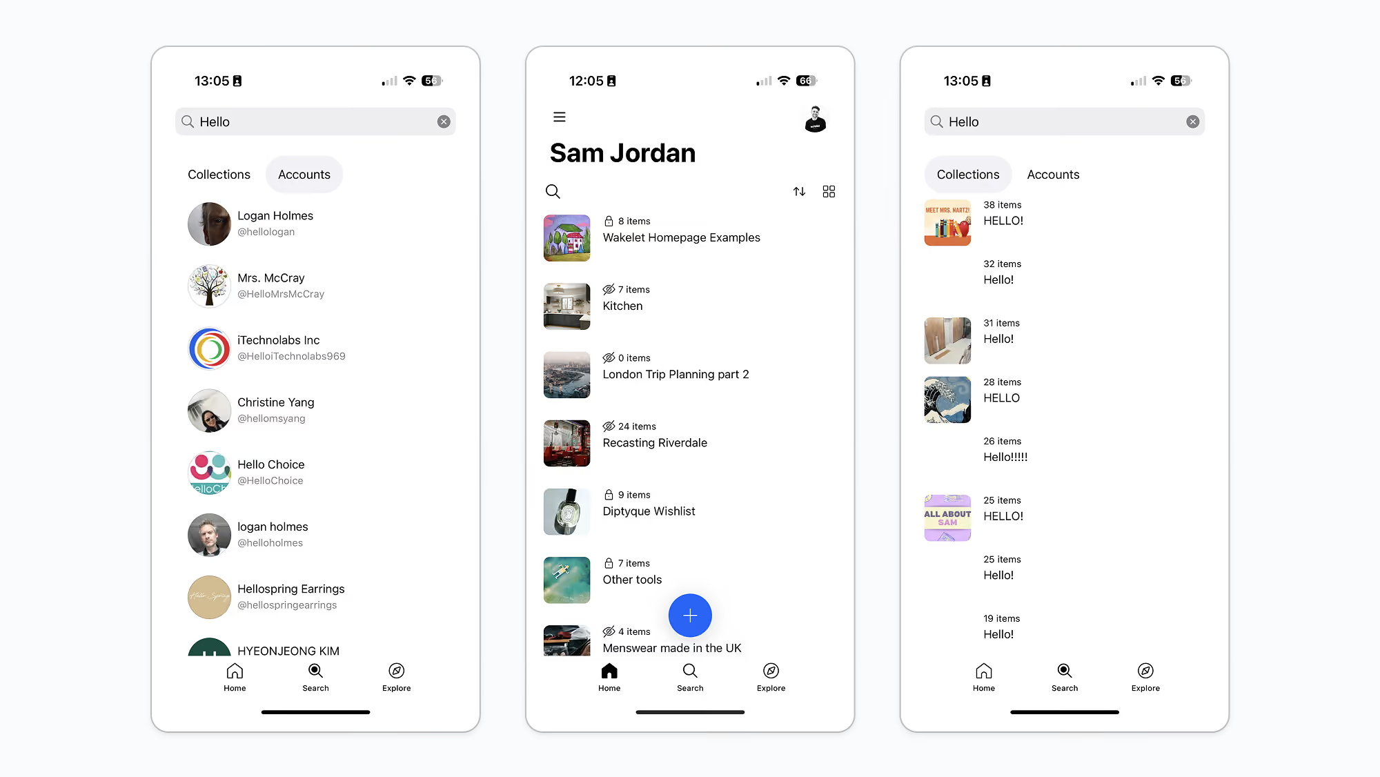
Auditing list-based interfaces to identify inconsistencies in layout, hierarchy, and interaction patterns across the iOS experience
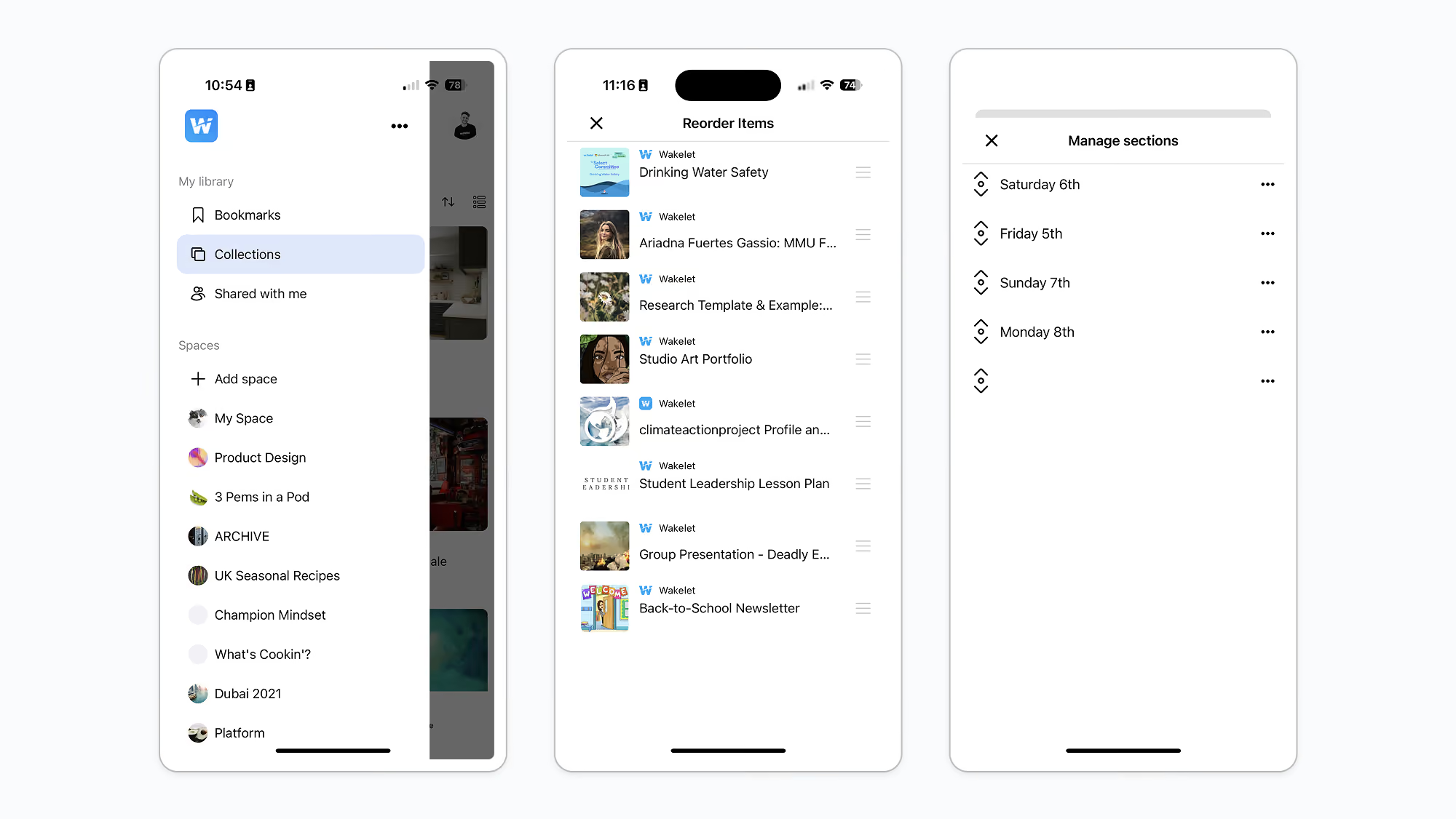
Reviewing management interfaces to identify opportunities for more consistent editing, organisation, and navigation patterns
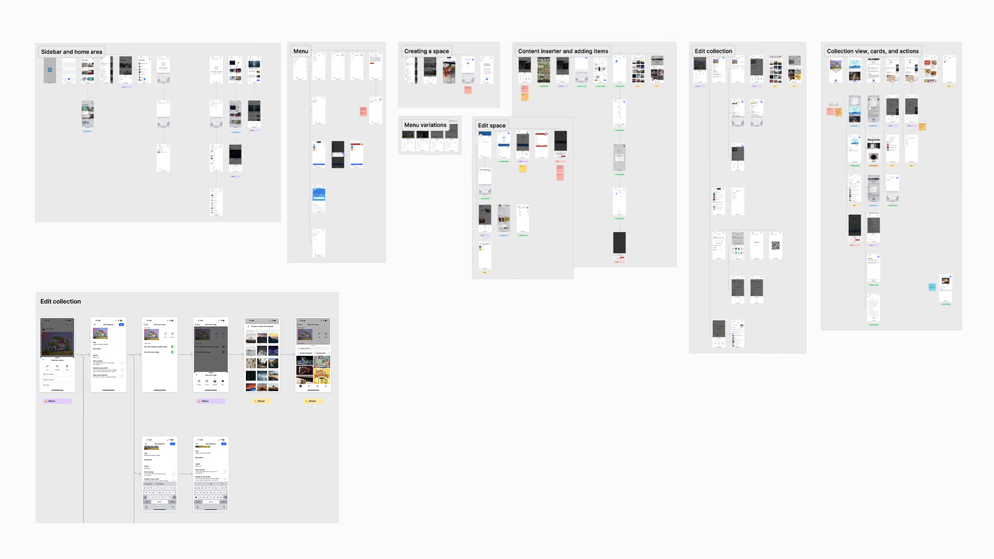
A comprehensive audit of the existing iOS experience, documenting interface patterns, user flows, and opportunities for cross-platform alignment
5. Defining the approach
This was a full redesign of the iOS app. To avoid repeating the mistakes that led to fragmentation originally, I grounded the work in a set of clear principles that would guide both design and implementation:
- Align information architecture with the web where it improved familiarity
- Simplify navigation to reflect user mental models
- Prefer iOS system components and patterns to reduce custom complexity and engineering overhead
- Preserve Wakelet’s visual identity through considered styling, motion, and interaction details
The goal was to create an experience that felt recognisably Wakelet, while also feeling native to iOS. Rather than treating mobile as a separate product, the redesign repositioned it as part of a cohesive Wakelet experience that users could move between seamlessly.
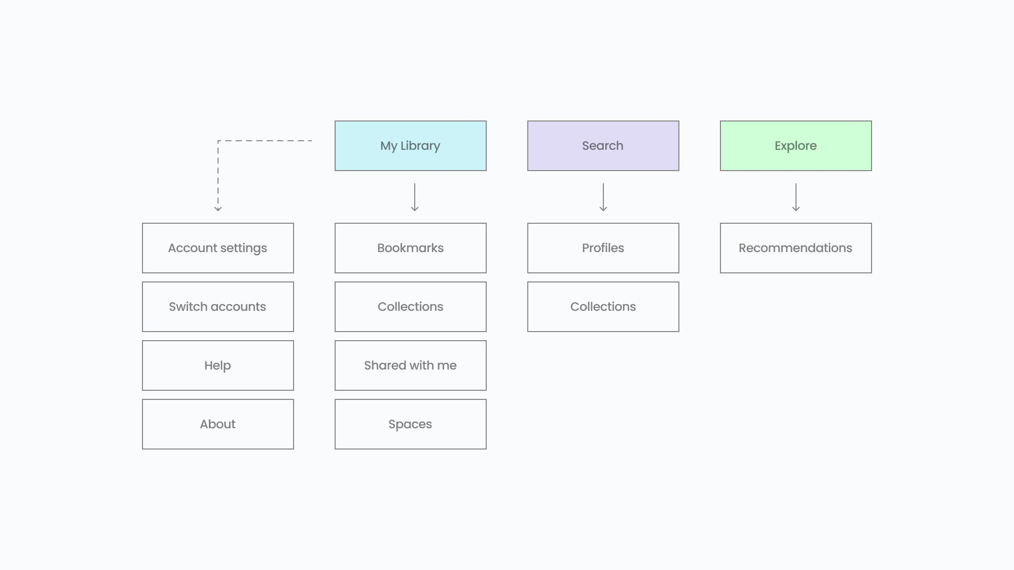
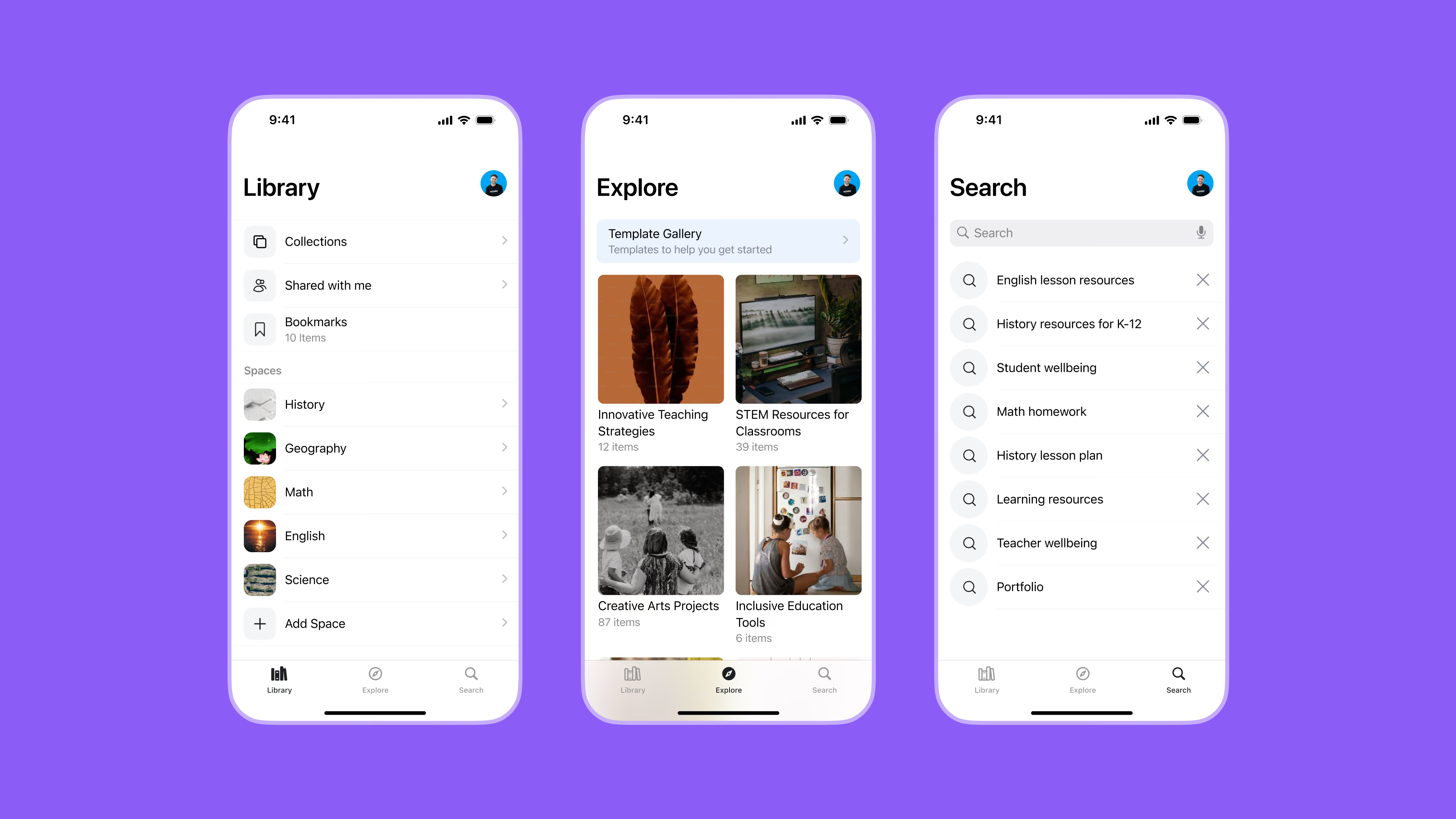
The redesigned information architecture, consolidating navigation into three core areas: My Library, Search, and Explore
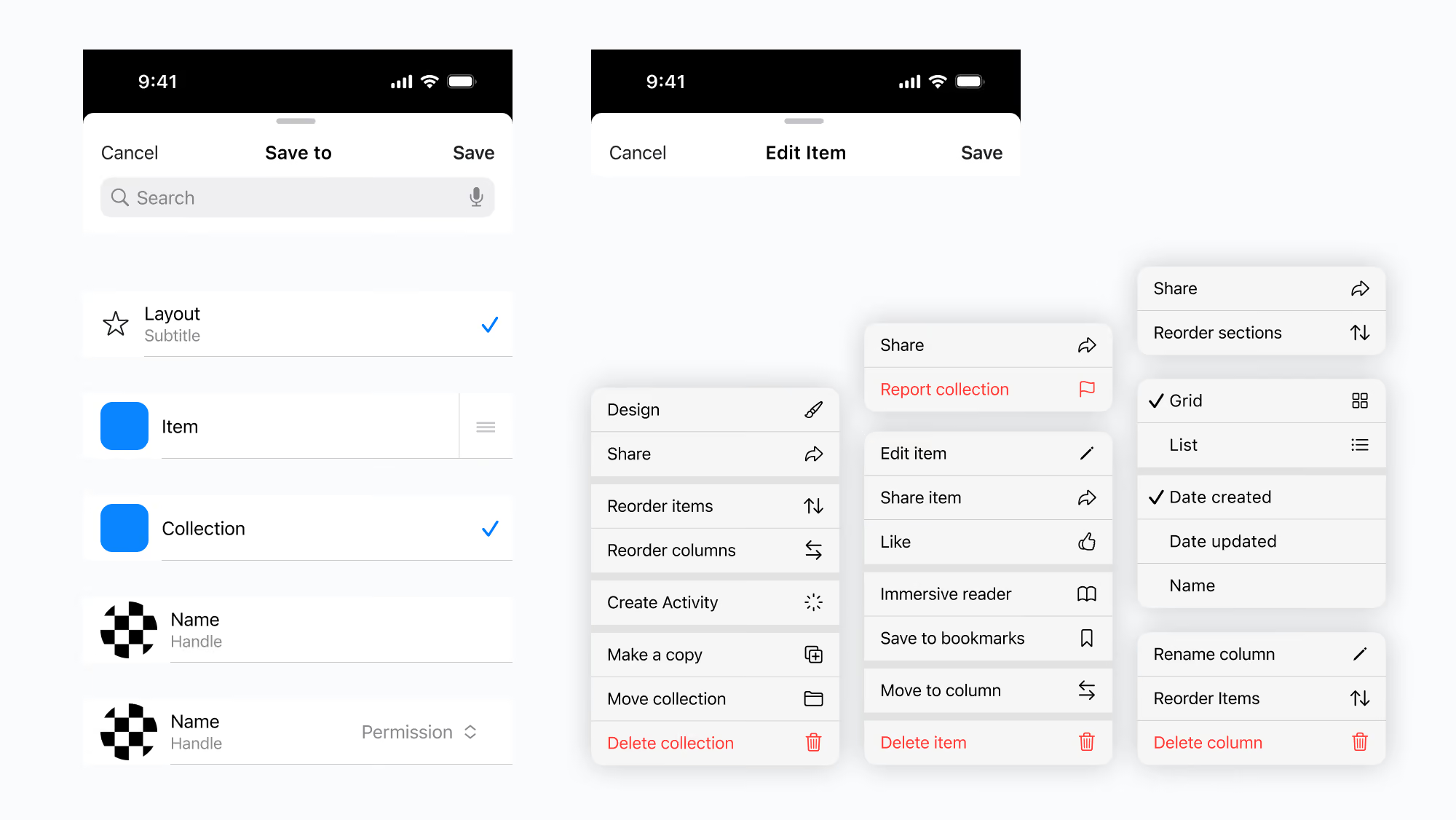
A library of standardised iOS system components created to establish consistent interaction patterns across the redesigned app
6. Design & Iteration
redesigned core areas of the app using iOS system components where appropriate, ensuring patterns such as navigation, lists, and actions behaved consistently with platform expectations, whilst keeping styling aligned to Wakelet’s visual identity.
Design work included:
- Restructuring navigation to mirror the web experience
- Replacing custom UI with iOS system components
- Standardising spacing, typography, and interaction patterns
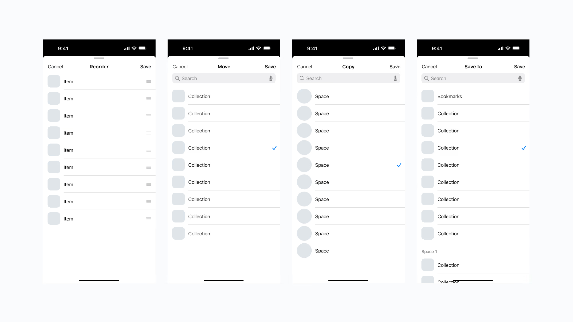
Reusable list views built using the new component library, providing consistent patterns for selection, organisation and content management
7. Outcome & Impact
The redesigned iOS experience:
- Reduced fragmentation between mobile and web
- Improved usability for users switching between platforms
- Reduced engineering overhead by replacing bespoke custom UI with standard iOS system components, reducing technical design debt and creating a more maintainable platform foundation.
- Created a maintainable, platform-native foundation for all future development
The result was a rebuilt iOS experience that was easier to maintain, faster to iterate on, and more coherent for users moving between platforms.
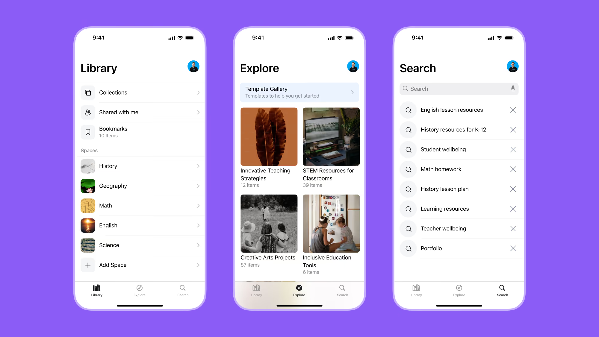
The redesigned navigation introduced a clearer information architecture, consistent interaction patterns, and closer alignment with the web experience
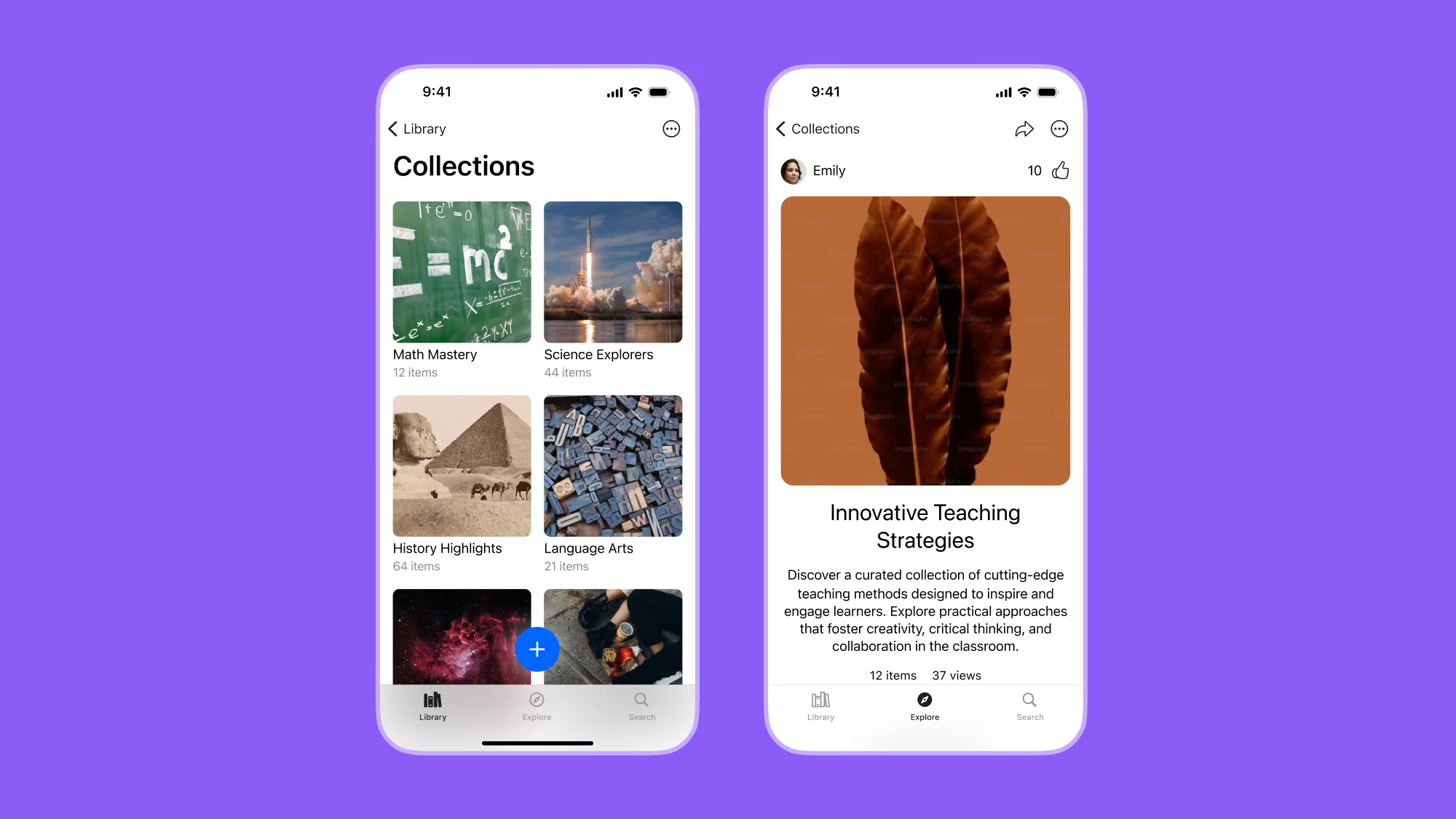
The redesigned collection experience, introducing a cleaner visual hierarchy and consistent navigation aligned with the wider platform
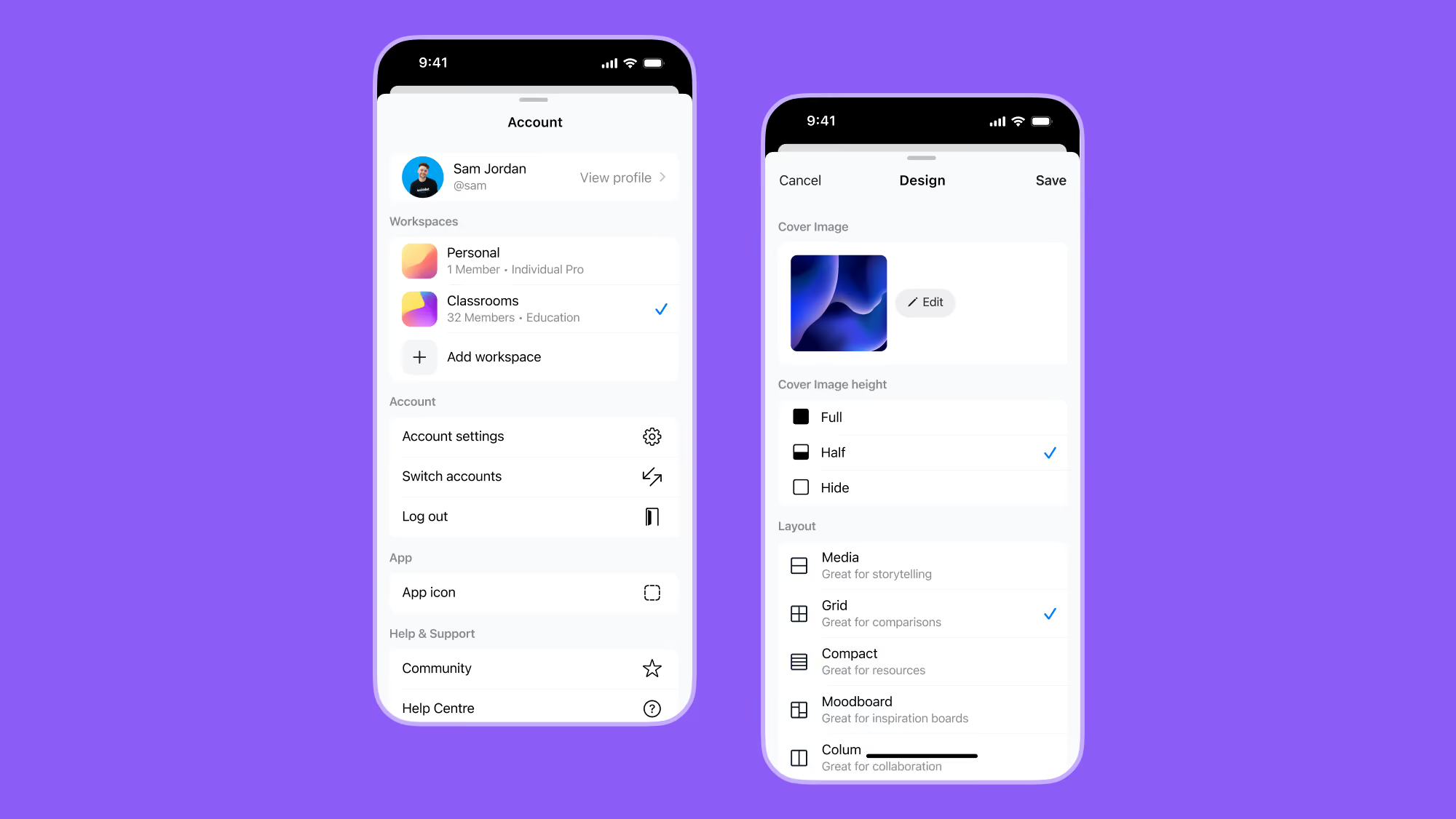
Examples of reusable sheets and inset grouped lists, demonstrating how shared interaction patterns were applied across multiple features
8. Reflection
This project highlighted the importance of understanding how users move between platforms. Designing for consistency across devices proved more valuable than optimising each platform in isolation.
It also reinforced the value of platform-native design as a way to balance usability, performance, and long-term maintainability.